Understand Your Data With
Data Visualization Services!
Visualize Data Like Never Before!
In today’s data-driven world, the ability to collect, analyze, and interpret large datasets is essential for any successful organization. But raw data alone doesn’t drive value it’s the insights you extract that lead to smarter decisions and competitive advantage.
As data volumes and complexity continue to increase, many businesses find it challenging to extract meaningful insights. This is where leveraging advanced data visualization techniques through professional services becomes a powerful solution, helping organizations interpret data more clearly and make informed decisions with confidence.
By transforming complex data into intuitive, interactive visuals, data visualization uncovers hidden patterns, trends, and relationships that are otherwise difficult to detect.
At PPN Solutions, our expert team delivers comprehensive data visualization services covering everything from consultation and design to implementation and continuous support. By leveraging the best tools for data visualization, we help you transform raw data into clear, actionable insights that drive smarter business decisions.
Integration and Transformation Process of Data Visualization
The process starts by gathering data from sources, like spreadsheets, APIs, and other files. This data is then processed using an ETL (Extract, Transform, Load) engine that cleans, transforms, and combines it into a unified view.
Then the integrated data is loaded into a data repository like a data warehouse or lake for efficient storage, access, and management. Various tools such, as Power BI and Tableau are then used to analyse the data and extract insights and meaningful patterns.
Finally, the analysed data is presented to you in an actionable manner enabling you to make informed decisions based on accurate information.
Data Acquisition
- Excel Sheet
- Files
- CRM
- API
Data Integration
- Extraction
- Transformation
- CRM
- Load
Data Warehouse
- Raw Data
- Summary Data
- Meta Data
Analysis
Report
- Dashboard
- Analysis
- Reporting
Process Behind Our Data Visualization Services
Meeting the Client
Requirements Gathering
Data Prep. & Analysis
Mockup Demo
Designing
User Testing
Maintenance/Support
Techniques We Use to Visualize Data Smartly
Waterfall Charts
Connectivity Charts
Funnel Charts
Heat Maps
Heat maps use color gradients to represent data density or intensity across a dataset. They’re perfect for identifying trends, patterns, and outliers at a glance. Whether you’re analyzing user clicks on a webpage or regional performance, heat maps make the data instantly digestible.
Donut Charts
Donut charts function like pie charts but with a blank center, offering a cleaner visual and space for added context. They’re great for comparing parts of a whole, like category shares or performance breakdowns. Ideal for dashboards and executive summaries.
Pie Charts
Bar Charts
Line Charts
Line charts are the go-to tool for displaying trends over time. They’re highly effective in tracking metrics like sales, growth, or performance across days, months, or years. Multiple lines can be used to compare different data series side by side.
Symbol Maps
Pivot Tables
Blog & News Update

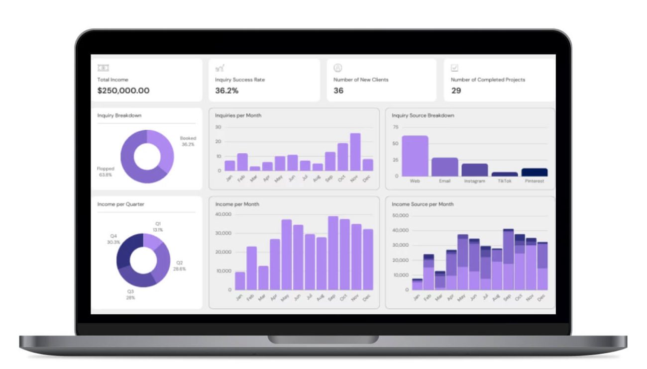
How to Apply Data Visualization Best Practices for Better Decisions
Data is one of the most valuable assets in modern organizations. But raw numbers alone don’t drive action—clear, strategic data

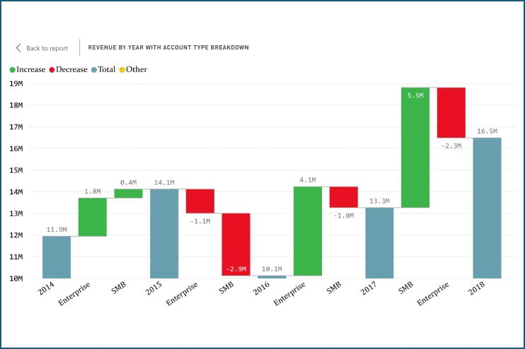
Trends Shaping the Future of Enterprise Data Visualization
Enterprise data visualization is evolving at a rapid pace as organizations demand faster insights, smarter automation, and more intuitive analytics

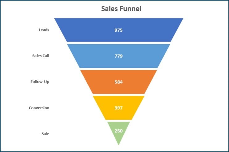
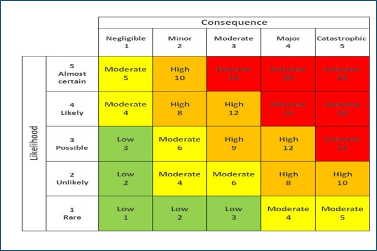
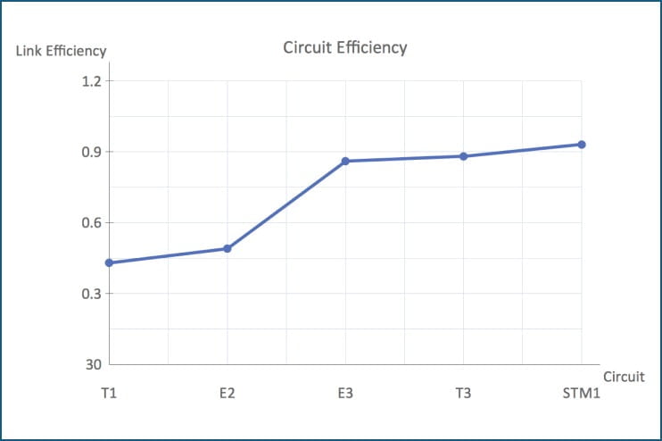
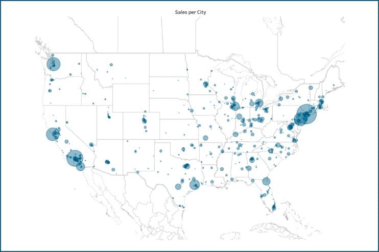
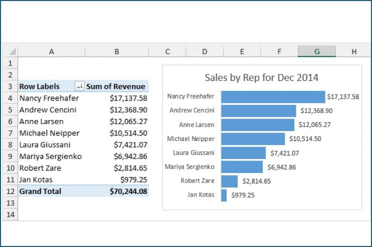
12 Types of Charts in Data Visualization and When to Use Them
Effective data visualization is key to transforming raw data into meaningful insights. Whether you’re working with sales reports, customer behavior,
